📊 How I Visualize My Tracked Study Time With Spreadsheets
Plus Two Templates For You
A year ago I shared how I time track, log and plan my language studies. Every so often I’m asked how I make my language study charts. I always thought they were basic (and messy) but I’ve learned that there are people who would still like to know exactly how I do it. I’ve also decided to share a few templates for those of you who don’t want to start from scratch. For the rest of you who want an explanation, here’s a little tutorial on how I create my charts using Google Sheets.
A time-tracking app isn’t necessary, it’s just what I use now. In the past, I’ve used a Google doc where I typed out my time and later inputted those numbers to create my charts.
The time tracking app I use is Toggl Track. If you're already using it or thinking about giving it a try, I want to point out that it comes with built-in charts. This means you don't necessarily have to go through the extra step of creating your own charts like I do. If you're satisfied with those charts, they're a great tool for gaining insights into your study time.
Since I wanted more customizability, I chose to make my own charts by importing my tracked data from Toggl into Google Sheets. I'll be showcasing both my weekly and monthly charts as the process remains essentially the same for both. As a bonus, I've also included an explanation of how I created my pixel grid.
📆 Weekly
📃 The Table
To start, I head to the reports page and navigate to the weekly view. From there, I hit Export and Download the CSV file. This action exports the time data into a spreadsheet file, ready for import into Google Sheets.
Reports page → weekly view → Export → Download CSV
To streamline the process, I stick to using the same Google Sheets file. This way, I simply replace last week’s study data with the new week's data, making the task much quicker. Exporting saves me time since I can easily copy and paste everything without issues. You can choose to import the exported CSV file into the template or have them on separate tabs to easily copy and paste.
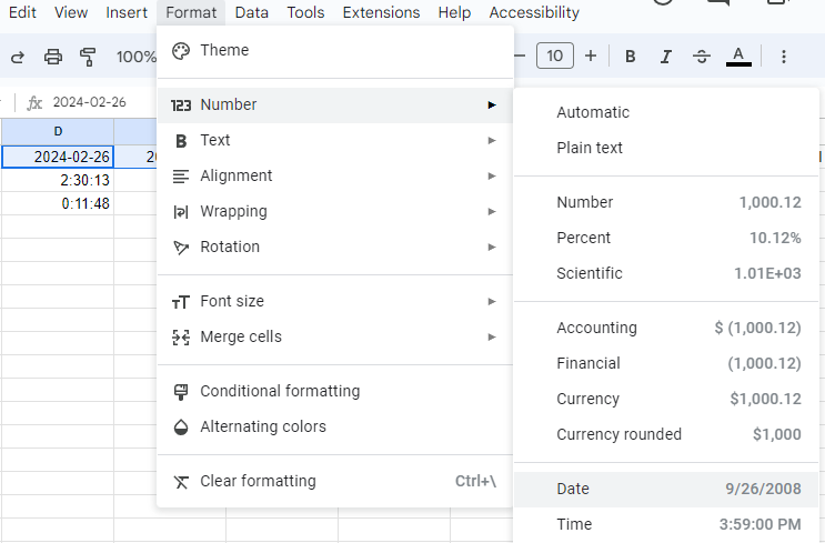
Additionally, I prefer my dates in the format DD/MM/YYYY rather than Toggl's default YYYY-MM-DD. To change it, I follow these steps: Select the dates, go to Format, then choose Number, and finally, select Date.
Select the dates → Format → Number → Date.
📊 The Column Chart
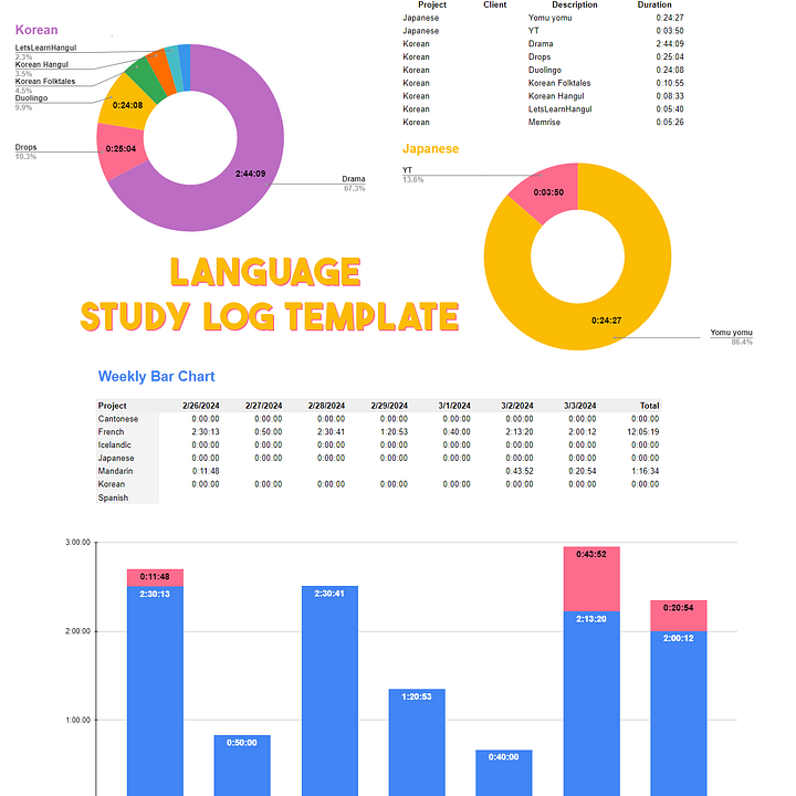
When I was consistently learning five languages, I used the column chart with a legend featuring the names of those languages at the top. However, since most weeks I’m only tracking 1-3 languages, I've transitioned to using a stacked column chart. The template includes both for you to test out.
Most of you who are now used to my weekly and monthly study recaps can easily identify which language each colour represents so I’ve chosen to remove the legend. If needed, the legend can be added, though I prefer to keep the chart basic as it’s part of my weekly recap, which already includes additional supporting information.
If there are unnecessary labels on your chart, you can delete the corresponding values instead of leaving them as 0:00:00 to prevent them from showing up. Sometimes, deleting values can alter the colours of the remaining values, which is why I choose to hide the legend. Since I create these charts every week, efficiency in the creation process is important to me so I do what works.
Customizing Charts
When editing the chart, you have the option to include data labels. Here are my preferred data label settings. Feel free to adjust the text and colour to your liking.
🥧 The Pie Chart
Weekly
The pie chart is much simpler as all I do is input the total hours studied for the week. I usually type it in by editing the 00:00:00.000 format. At some point I had put in a custom number format [h]"h "mm"m" because I wanted the labelled values to show up as 00h00m.
To create the chart, I select the language names and durations, insert a chart, choose the pie chart type, and customize it to my preference.
Select the language names and durations → insert chart → (chart type) pie chart
Monthly Tracked Activities
For the monthly tracked activities, I use the data from Toggl's Reports page to view a full month summary, which I export as a CSV file. This provides me with a list of every activity I tracked in each language during the month. Next, I select the description and duration columns for one language, insert a chart, choose the pie chart type, and then proceed to customize the chart by adjusting the title, fonts, and finally adding labels to the pie slices.
Select the description and duration columns for one language → insert chart → (chart type) pie chart
📅 Monthly Chart
The data values for my monthly chart are quite straightforward. I use Toggl and simply type out the numbers in a list. Then, I select all the values in that list, insert a chart, and change the chart type to a Column chart. This same format can also be used if you're creating a yearly chart, with the study time in each month serving as your values.
Select all values in the list → insert chart → (chart type) to Column chart
✨ Pixel Grid
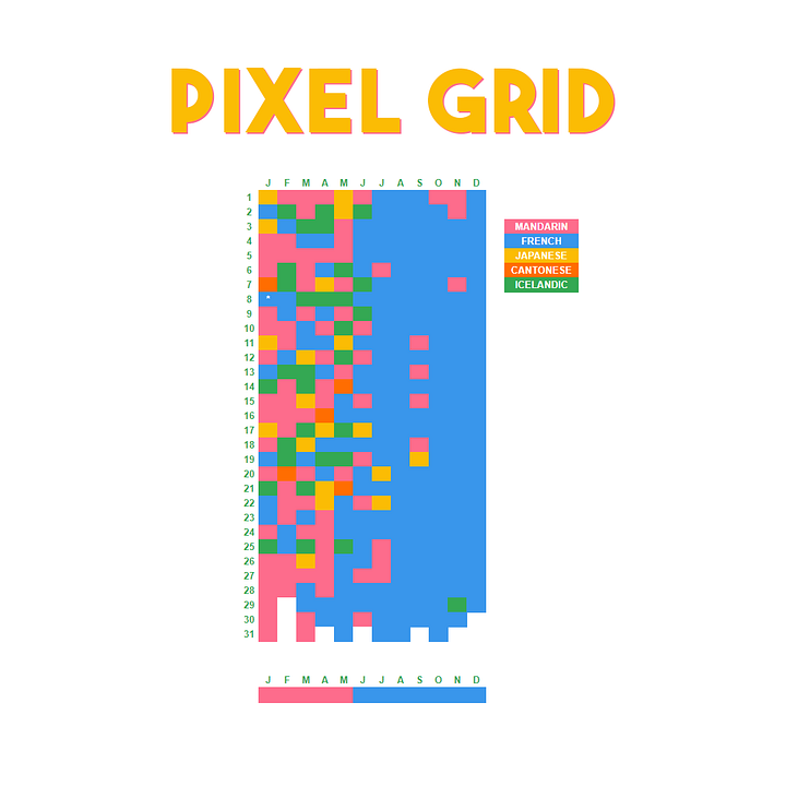
Last year, I wanted to visualize the language I spent the most time learning each day, so I decided to create a pixel grid. Although the result is simple, deciding how I wanted it to look took some time.
Each grid is coloured according to the language that was most studied for that day. Below, there's another line grid to indicate the language studied the most each month.
I found the pixel grid extremely helpful in understanding my language learning habits throughout the year. You can use the grid to track any type of habit by simply changing the legend.
⭐ Templates
You can create your own spreadsheets using my explanations but if you’d like a template to use as a base or play around with, I have created a language study log template and a pixel grid.
I hope you find them useful!


The language study log template includes:
Weekly pie chart
Weekly bar chart
Monthly bar chart
Monthly pie chart
Monthly tracked activities pie charts
Got a question about the templates? Feel free to send me a message.
You can also leave a comment about how you track your studies or if you prefer not to track.
I hope this was helpful. Happy language learning!


I have always been inspired by Victoria's articles and in-depth study stats. She greatly influenced my decision to write on Substack, and her articles were the primary factor in my switch from my previous app to Toggl. Coincidentally, I've been focusing on improving my Google Sheets skills this month, so finding this post was perfect timing. With this template and newsletter for guidance, I now have everything I need to make progress in organizing and analyzing my language studies with fresh resolve and an organized approach. 😊
I love a good spreadsheet!! This is so similar to my work dashboard it's scary 😁